Archives for 

seo

What the Local Customer Service Ecosystem Looks Like in 2019

Posted by MiriamEllis

Everything your brand does in the new year should support just one goal: better local customer service.

Does this sound too simple? Doesn’t marketing brim with a thousand different tasks? Of course — but if the goal of each initiative isn’t to serve the customer better, it’s time for a change of business heart. By putting customers, and their problems, at the absolute center of your brand’s strategy, your enterprise will continuously return to this heart of the matter, this heart of commerce.

What is local customer service in 2019?

It’s so much more than the face-to-face interactions of one staffer with one shopper. Rather, it’s a commitment to becoming an always-on resource that is accessible to people whenever, wherever and however they need it. A Google rep was recently quoted as saying that 46% of searches have a local intent. Mobile search, combined with desktop and various forms of ambient search, have established the local web as man’s other best friend, the constant companion that’s ever ready to serve.

Let’s position your brand to become that faithful helper by establishing the local customer service ecosystem:
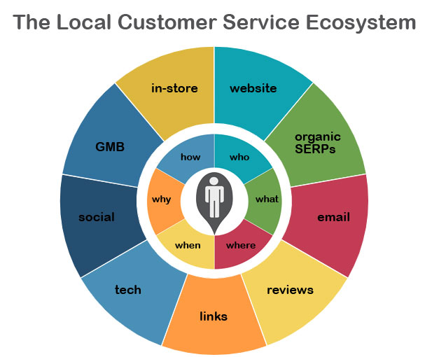
Your Key to the Local Customer Service Ecosystem

At the heart sits the local customer, who wants to know:

  • Who can help them, who likes or dislikes a business, who’s behind a brand, who’s the best, cheapest, fastest, closest, etc.
  • What the answer is to their question, what product/service solves their problems, what businesses are nearby, what it’s like there, what policies protect them, what’s the phone number, the website URL, the email address, etc.
  • Where a business is located, where to find parking, where something is manufactured or grown, etc.
  • When a business is open, when sales or events are, when busiest times are, when to purchase specific products/services or book an appointment, etc.
  • Why a business is the best choice based on specific factors, why a business was founded, why people like/dislike a business, etc.
  • How to get to the business by car/bike/on foot, how to learn/do/buy something, how to contact the right person or department, how to make a complaint or leave feedback, how the business supports the community, etc.

Your always-on customer service solves all of these problems with a combination of all of the following:

In-store

Good customer service looks like:

  • A publicly accessible brand policy that protects the rights and defends the dignity of both employees and consumers.
  • Well-trained phone staff with good language skills, equipped to answer FAQs and escalate problems they can’t solve. Sufficient staff to minimize hold-times.
  • Well-trained consumer-facing staff, well-versed in policy, products and services. Sufficient staff to be easily-accessible by customers.
  • In-store signage (including after-hours messaging) that guides consumers towards voicing complaints in person, reducing negative reviews.
  • In-store signage/messaging that promotes aspects of the business that are most beneficial to the community. (philanthropy, environmental stewardship, etc.) to promote loyalty and word-of-mouth.
  • Cleanliness, orderliness and fast resolution of broken fixtures and related issues.
  • Equal access to all facilities with an emphasis on maximum consumer comfort and convenience.
  • Support of payment forms most popular with local customers (cash, check, digital, etc.), security of payment processes, and minimization of billing mistakes/hassles.
  • Correctly posted, consistent hours of operation, reducing inconvenience. Clear messaging regarding special hours/closures.
  • A brand culture that rewards employees who wisely use their own initiative to solve customers’ problems.

Website

Good customer service looks like:

  • Content that solves people’s problems as conveniently and thoroughly as possible in language that they speak. Everything you publish (home, about, contact, local landing pages, etc.) should pass the test of consumer usefulness.
  • Equal access to content, regardless of device.
  • Easily accessible contact information, including name, address, phone number, fax, email, text, driving directions, maps and hours of operation.
  • Signals of trustworthiness, such as reviews, licenses, accreditations, affiliations, and basic website security.
  • Signals of benefit, including community involvement, philanthropy, environmental protections, etc.
  • Click-to-call phone numbers.
  • Clear policies that outline the rights of the consumer and the brand.

Organic SERPs

Good customer service looks like:

  • Management of the first few pages of the organic SERPs to ensure that basic information on them is accurate. This includes structured citations on local business directories, unstructured citations on blog posts, news sites, top 10 lists, review sites, etc. It can also include featured snippets.
  • Management also includes monitoring of the SERPs for highly-ranked content that cites problems others are having with the brand. If these problems can be addressed and resolved, the next step is outreach to the publisher to demonstrate that the problem has been addressed.

Email

Good customer service looks like:

  • Accessible email addresses for customers seeking support and fast responses to queries.
  • Opt-in email marketing in the form of newsletters and special offers.

Reviews

Good customer service looks like:

  • Accuracy of basic business information on major review platforms.
  • Professional and fast responses to both positive and negative reviews, with the core goal of helping and retaining customers by acknowledging their voices and solving their problems.
  • Sentiment analysis of reviews by location to identify emerging problems at specific branches for troubleshooting and resolution.
  • Monitoring of reviews for spam and reporting it where possible.
  • Avoidance of any form of review spam on the part of the brand.
  • Where allowed, guiding valued customers to leave reviews to let the greater community know about the existence and quality of your brand.

Links

Good customer service looks like:

  • Linking out to third-party resources of genuine use to customers.
  • Pursuit of inbound links from relevant sites that expand customers’ picture of what’s available in the place they live, enriching their experience.

Tech

Good customer service looks like:

  • Website usability and accessibility for users of all abilities and on all browsers and devices (ADA compliance, mobile-friendliness, load speed, architecture, etc.)
  • Apps, tools and widgets that improve customers’ experience.
  • Brand accessibility on social platforms most favored by customers.
  • Analytics that provide insight without trespassing on customers’ comfort or right to privacy.

Social

Good customer service looks like:

  • Brand accessibility on social platforms most favored by customers.
  • Social monitoring of the brand name to identify and resolve complaints, as well as to acknowledge praise.
  • Participation for the sake of community involvement as opposed to exploitation. Sharing instead of selling.
  • Advocacy for social platforms to improve their standards of transparency and their commitment to protections for consumers and brands.

Google My Business

Good customer service looks like:

  • Embrace of all elements of Google’s local features (Google My Business listings, Knowledge Panels, Maps, etc.) that create convenience and accessibility for consumers.
  • Ongoing monitoring for accuracy of basic information.
  • Brand avoidance of spam, and also, reporting of spam to protect consumers.
  • Advocacy for Google to improve its standards as a source of community information, including accountability for misinformation on their platform, and basic protections for both brands and consumers.

Customers’ Problems are Yours to Solve

“$41 billion is lost each year by US companies following a bad customer experience.”
New Voice Media

When customers don’t know where something is, how something works, when they can do something, who or what can help them, or why they should choose one option over another, your brand can recognize that they are having a problem. It could be as small a problem as where to buy a gift or as large a problem as seeking legal assistance after their home has been damaged in a disaster.

With the Internet never farther away than fingertips or voices, people have become habituated to turning to it with most of their problems, hour by hour, year by year. Recognition of quests for help may have been simpler just a few decades ago when customers were limited to writing letters, picking up phones, or walking into stores to say, “I have a need.” Now, competitive local enterprises have to expand their view to include customer problems that play out all over the web with new expectations of immediacy.

Unfortunately, brands are struggling with this, and we can sum up common barriers to modern customer service in 3 ways:

1) Brand Self-Absorption

“I’ve gotta have my Pops,” frets a boy in an extreme (and, frankly, off-putting) example in which people behave as though addicted to products. TV ads are rife with the wishfulness of marketers pretending that consumers sing and dance at the mere idea of possessing cars, soda, and soap. Meanwhile, real people stand at a distance watching the song and dance, perhaps amused sometimes, but aware that what’s on-screen isn’t them.

“We’re awesome,” reads too much content on the web, with a brand-centric, self-congratulatory focus. At the other end of the spectrum, web pages sit stuffed with meaningless keywords or almost no text as all, as though there aren’t human beings trying to communicate on either side of the screen.

“Who cares?” is the message untrained employees, neglected shopping environments, and disregarded requests for assistance send when real-world locations open doors but appear to put customer experience as their lowest priority. I’ve catalogued some of my most disheartening customer service interludes and I know you’ve had them, too.

Sometimes, brands get so lost in boardrooms, it’s all they can think of to put in their million-dollar ad campaigns, forgetting that most of their customers don’t live in that world.

One of the first lightbulb moments in the history of online content marketing was the we-you shift. Instead of writing, “We’re here, isn’t that great?”, we began writing, “You’re here and your problem can be solved.” This is the simple but elegant evolution that brands, on the whole, need to experience.

2) Ethical Deficits

Sometimes, customers aren’t lost because a brand is too inwardly focused, but rather, because its executives lack the vision to sustain an ethical business model. Every brand is tasked with succeeding, but it takes civic-minded, customer-centric leadership to avoid the abuses we are seeing at the highest echelons of the business world right now. Google, Facebook, Amazon, Uber, and similar majors have repeatedly failed to put people over profits, resulting in:

  • Scandals
  • Lawsuits
  • Fines
  • Boycotts
  • Loss of consumer trust
  • Employee loss of pride in company culture

At a local business level, and in a grand understatement, it isn’t good customer service when a company deceives or harms the public. Brands, large and small, want to earn the right of integration into the lives of their customers as chosen resources. Large enterprises seeking local customers need leadership that can envision itself in the setting of a single small community, where dishonest practices impact real lives and could lead to permanent closure. Loss of trust should never be an acceptable part of economies of scale.

The internet has put customers, staffers, and media all on the same channels. Ethical leadership is the key ingredient to building a sustainable business model in which all stakeholders take pride.

3) Lack of Strategy

Happily, many brands genuinely do want to face outward and possess the ethics to treat people well. They may simply lack a complete strategy for covering all the bases that make up a satisfying experience. Small local businesses may find lack of time or resources a bar to the necessary education, and structure at enterprises may make it difficult to get buy-in for the fine details of customer service initiatives. Priorities and budgets may get skewed away from customers instead of toward them.

The TL;DR of this entire post is that modern customer service means solving customers’ problems by being wherever they are when they seek solutions. Beyond that, a combination of sufficient, well-trained staff (both online and off) and the type of automation provided by tools that manage local business listings, reviews and social listening are success factors most brands can implement.

Reach Out…

We’ve talked about some negative patterns that can either distance brands from customers, or cause customers to distance themselves due to loss of trust. What’s the good news?

Every single employee of every local brand in the US already knows what good customer service feels like, because all of us are customers.

There’s no mystery or magic here. Your CEO, your devs, sales team, and everyone else in your organization already know by experience what it feels like to be treated well or poorly.

And they already know what it’s like when they see themselves reflected in a store location or on a screen.

Earlier, I cited an old TV spot in which actors were paid to act out the fantasy of a brand. Let’s reach back in time again and watch a similar-era commercial in which actors are paid to role play genuine consumer problems – in this case, a family that wants to keep in touch with a member who is away from home:

The TV family may not look identical to yours, but their featured problem – wanting to keep close to a distant loved one – is one most people can relate to. This 5-year ad campaign won every award in sight, and the key to it is that consumers could recognize themselves on the screen and this act of recognition engaged their emotions.

Yes, a service is being sold (long distance calling), but the selling is being done by putting customers in the starring roles and solving their problems. That’s what good customer service does, and in 2019, if your brand can parlay this mindset into all of the mediums via which people now seek help, your own “reach out and touch someone” goals are well on their way to success.

Loyal Service Sparks Consumer Loyalty

“Acquiring a new customer is anywhere from five to twenty times more expensive than retaining an existing one.”
Harvard Business Review
“Loyal customers are worth up to ten times as much as their first purchase.”
White House Office of Consumer Affairs

I want to close here with a note on loyalty. With a single customer representing up to 10x the value of their first purchase, earning a devoted clientele is the very best inspiration for dedication to improving customer service.

Trader Joe’s is a large chain that earns consistent mentions for its high standards of customer service. Being a local SEO, I turned to its Google reviews, looking at 5 locations in Northern California. I counted 225 instances of people exuberantly praising staff at just these 5 locations, using words like “Awesome, incredible, helpful, friendly, and fun!”. Moreover, reviewers continuously mentioned the brand as the only place they want to shop for groceries because they love it so much. It’s as close as you can get to a “gotta have my Pops” scenario, but it’s real.

How does Trader Joe’s pull this off? A study conducted by Temkin Group found that, “A customer’s emotional experience is the most significant driver of loyalty, especially when it comes to consumers recommending firms to their friends.” The cited article lists emotional connection and content, motivated employees who are empowered to go the extra mile as keys to why this chain was ranked second-highest in emotion ratings (a concept similar to Net Promoter Score). In a word, the Trader Joe’s customer service experience creates the right feelings, as this quick sentiment cloud of Google review analysis illustrates:

This brand has absolutely perfected the thrilling and lucrative art of creating loyal customers, making their review corpus read like a volume of love letters. The next move for this company – and for the local brands you market – is to “spread the love” across all points where a customer might seek to connect, both online and off.

It’s a kind of love when you ensure a customer isn’t misdirected by a wrong address on a local business listing or when you answer a negative review with the will to make things right. It’s a kind of love when a company blog is so helpful that its comments say, “You must be psychic! This is the exact problem I was trying to solve.” It’s a kind of love when a staff member is empowered to create such a good experience that a customer tells their mother, their son, their best friend to trust you brand.

Love, emotions, feelings — are we still talking about business here? Yes, because when you subtract the medium, the device, the screen, it’s two very human people on either side of every transaction.


Sign up for The Moz Top 10, a semimonthly mailer updating you on the top ten hottest pieces of SEO news, tips, and rad links uncovered by the Moz team. Think of it as your exclusive digest of stuff you don’t have time to hunt down but want to read!

Continue reading →
Building Links with Great Content – Natural Syndication Networks

Posted by KristinTynski

The debate is over and the results are clear: the best way to improve domain authority is to generate large numbers of earned links from high-authority publishers.

Getting these links is not possible via:

  • Link exchanges
  • Buying links
  • Private Blog Networks, or PBNs
  • Comment links
  • Paid native content or sponsored posts
  • Any other method you may have encountered

There is no shortcut. The only way to earn these links is by creating content that is so interesting, relevant, and newsworthy to a publisher’s audience that the publisher will want to write about that content themselves.

Success, then, is predicated on doing three things extremely well:

  1. Developing newsworthy content (typically meaning that content is data-driven)
  2. Understanding who to pitch for the best opportunity at success and natural syndication
  3. Writing and sending pitches effectively

We’ve covered point 1 and point 3 on other Moz posts. Today, we are going to do a deep dive into point 2 and investigate methods for understanding and choosing the best possible places to pitch your content. Specifically, we will reveal the hidden news syndication networks that can mean the difference between generating less than a handful or thousands of links from your data-driven content.

Understanding News Syndication Networks

Not all news publishers are the same. Some publishers behave as hubs, or influencers, generating the stories and content that is then “picked up” and written about by other publishers covering the same or similar beats.

Some of the top hubs should be obvious to anyone: CNN, The New York Times, BBC, or Reuters, for instance. Their size, brand authority, and ability to break news make them go-to sources for the origination of news and some of the most common places journalists and writers from other publications go to for story ideas. If your content gets picked up by any of these sites, it’s almost certain that you will enjoy widespread syndication of your story to nearly everywhere that could be interested without any intervention on your part.

Unfortunately, outside of the biggest players, it’s often unclear which other sites also enjoy “Hub Status,” acting as a source for much of the news writing that happens around any specific topic or beat.

At Fractl, our experience pitching top publishers has given us a deep intuition of which domains are likely to be our best bet for the syndication potential of content we create on behalf of our clients, but we wanted to go a step further and put data to the question. Which publishers really act as the biggest hubs of content distribution?

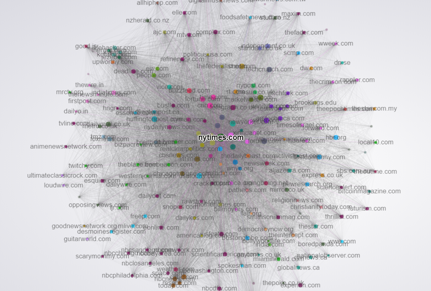
To get a better handle on this question, we took a look at the link networks of the top 400 most trafficked American publishers online. We then utilized Gephi, a powerful network visualization tool to make sense of this massive web of links. Below is a visualization of that network.

An interactive version is available here.

Before explaining further, let’s detail how the visualization works:

  • Each colored circle is called a node. A node represents one publisher/website
  • Node size is related to Domain Authority. The larger the node, the more domain authority it has.
  • The lines between the nodes are called edges, and represent the links between each publisher.
  • The strength of the edges/links corresponds to the total number of links from one publisher to another. The more links from one publisher to another, the stronger the edge, and the more “pull” exerted between those two nodes toward each other.
  • You can think of the visualization almost like an epic game of tug of war, where nodes with similar link networks end up clustering near each other.
  • The colors of the nodes are determined by a “Modularity” algorithm that looks at the overall similarity of link networks, comparing all nodes to each other. Nodes with the same color exhibit the most similarity. The modularity algorithm implemented in Gephi looks for the nodes that are more densely connected together than to the rest of the network

Once visualized, important takeaways that can be realized include the following:

  1. The most “central” nodes, or the ones appearing near the center of the graph, are the ones that enjoy links from the widest variety of sites. Naturally, the big boys like Reuters, CNN and the NYTimes are located at the center, with large volumes of links incoming from all over.
  2. Tight clusters are publishers that link to each other very often, which creates a strong attractive force and keeps them close together. Publishers like these are often either owned by the same parent company or have built-in automatic link syndication relationships. A good example is the Gawker Network (at the 10PM position). The closeness of nodes in this network is the result of heavy interlinking and story syndication, along with the effects of site-wide links shared between them. A similar cluster appears at the 7PM position with the major NBC-owned publishers (NBC.com, MSNBC.com, Today.com, etc.). Nearby, we also see large NBC-owned regional publishers, indicating heavy story syndication also to these regional owned properties.
  3. Non-obvious similarities between the publishers can also be gleaned. For instance, notice how FoxNews.com and TMZ.com are very closely grouped, sharing very similar link profiles and also linking to each other extensively. Another interesting cluster to note is the Buzzfeed/Vice cluster. Notice their centrality lies somewhere between serious news and lifestyle, with linkages extending out into both.
  4. Sites that cover similar themes/beats are often located close to each other in the visualization. We can see top-tier lifestyle publishers clustered around the 1PM position. News publishers clustered near other news publishers with similar political leanings. Notice the closeness of Politico, Salon, The Atlantic, and The Washington Post. Similarly, notice the proximity of Breitbart, The Daily Caller, and BizPacReview. These relationships hint at hidden biases and relationships in how these publishers pick up each other’s stories.

A More Global Perspective

Last year, a fascinating project by Kalev Leetaru at Forbes looked at the dynamics Google News publishers in the US and around the world. The project leveraged GDelt’s massive news article dataset, and visualized the network with Gephi, similarly to the above network discussed in the previous paragraph.

This visualization differs in that the link network was built looking only at in-context links, whereas the visualization featured in the previous paragraph looked at all links. This is perhaps an even more accurate view of news syndication networks because it better parses out site-wide links, navigation links, and other non-context links that impact the graph. Additionally, this graph was generated using more than 121 million articles from nearly every country in the world, containing almost three-quarters of a billion individual links. It represents one of the most accurate pictures of the dynamics of the global news landscape ever assembled.

Edge weights were determined by the total number of links from each node to each other node. The more links, the stronger the edge. Node sizes were calculated using Pagerank in this case instead of Domain Authority, though they are similar metrics.

Using this visualization, Mr. Leetaru was able to infer some incredibly interesting and potentially powerful relationships that have implications for anyone who pitches mainstream publishers. Some of the most important include:

  1. In the center of the graph, we see a very large cluster. This cluster can be thought of as essentially the “Global Media Core,” as Mr. Leetaru puts it. Green nodes represent American outlets. This, as with the previous example, shows the frequency with which these primary news outlets interlink and cover each other’s stories, as well as how much less frequently they cite sources from smaller publications or local and regional outlets.
  2. Interestingly, CNN seems to play a unique role in the dissemination to local and regional news. Note the many links from CNN to the blue cluster on the far right. Mr. Leetaru speculates this could be the result of other major outlets like the NYTimes and the Washington Post using paywalls. This point is important for anyone who pitches content. Paywalls should be something taken into consideration, as they could potentially significantly reduce syndication elsewhere.
  3. The NPR cluster is another fascinating one, suggesting that there is heavy interlinking between NPR-related stories and also between NPR and the Washington Post and NYTimes. Getting a pickup on NPR’s main site could result in syndication to many of its affiliates. NYTimes or Washington Post pickups could also have a similar effect due to this interlinking.
  4. For those looking for international syndication, there are some other interesting standouts. Sites like NYYibada.com cover news in the US. They are involved with Chinese language publications, but also have versions in other languages, including English. Sites like this might not seem to be good pitch targets, but could likely be pitched successfully given their coverage of many of the same stories as US-based English language publications.
  5. The blue and pink clusters at the bottom of the graph are outlets from the Russian and Ukrainian press, respectively. You will notice that while the vast majority of their linking is self-contained, there seem to be three bridges to international press, specifically via the BBC, Reuters, and AP. This suggests getting pickups at these outlets could result in much broader international syndication, at least in Eastern Europe and Russia.
  6. Additionally, the overall lack of deep interlinking between publications of different languages suggests that it is quite difficult to get English stories picked up internationally.
  7. Sites like ZDnet.com have foreign language counterparts, and often translate their stories for their international properties. Sites like these offer unique opportunities for link syndication into mostly isolated islands of foreign publications that would be difficult to reach otherwise.

I would encourage readers to explore this interactive more. Isolating individual publications can give deep insight into what syndication potential might be possible for any story covered. Of course, many factors impact how a story spreads through these networks. As a general rule, the broader the syndication network, the more opportunities that exist.

Link Syndication in Practice

Over our 6 years in business, Fractl has executed more than 1,500 content marketing campaigns, promoted using high-touch, one-to-one outreach to major publications. Below are two views of content syndication we have seen as a result of our content production and promotion work.

Let’s first look just at a single campaign.

Recently, Fractl scored a big win for our client Signs.com with our “Branded in Memory” campaign, which was a fun and visual look at how well people remember brand logos. We had the crowd attempt to recreate well-known brand logos from memory, and completed data analysis to understand more deeply which brands seem to have the best overall recall.

As a result of strategic pitching, the high public appeal, and the overall “coolness” factor of the project, it was picked up widely by many mainstream publications, and enjoyed extensive syndication.

Here is what that syndication looked like in network graph form over time:

If you are interested in seeing and exploring the full graph, you can access the interactive by clicking on the gif above, or clicking here. As with previous examples, node size is related to domain authority.

A few important things to note:

  • The orange cluster of nodes surrounding the central node are links directly to the landing page on Signs.com.
  • Several pickups resulted in nodes (publications) that themselves generated many numbers of links pointing at the story they wrote about the Signs.com project. The blue cluster at the 8PM position is a great example. In this case it was a pickup from BoredPanda.com.
  • Nodes that do not link to Signs.com are secondary syndications. They pass link value through the node that links to Signs.com, and represent an opportunity for link reclamation. Fractl follows up on all of these opportunities in an attempt to turn these secondary syndications into do-follow links pointing directly at our client’s domain.
  • An animated view gives an interesting insight into the pace of link accumulation both to the primary story on Signs.com, but also to the nodes that garnered their own secondary syndications. The GIF represents a full year of pickups. As we found in my previous Moz post examining link acquisition over time, roughly 50% of the links were acquired in the first month, and the other 50% over the next 11 months.

Now, let’s take a look at what syndication networks look like when aggregated across roughly 3 months worth of Fractl client campaigns (not fully comprehensive):

If you are interested in exploring this in more depth, click here or the above image for the interactive. As with previous examples, node size is related to domain authority.

A few important things to note:

  1. The brown cluster near the center labeled “placements” are links pointing back directly to the landing pages on our clients’ sites. Many/most of these links were the result of pitches to writers and editors at those publications, and not as a result of natural syndication.
  2. We can see many major hubs with their own attached orbits of linking nodes. At 9PM, we see entrepreneur.com, at 12PM we see CNBC.com, 10PM we see USAToday, etc.
  3. Publications with large numbers of linking nodes surrounding them are examples of prime pitching targets, given how syndications link back to stories on those publications appear in this aggregate view.

Putting it All Together

New data tools are enabling the ability to more deeply understand how the universe of news publications and the larger “blogosphere” operate dynamically. Network visualization tools in particular can be put to use to yield otherwise impossible insights about the relationships between publications and how content is distributed and syndicated through these networks.

The best part is that creating visualizations with your own data is very straightforward. For instance, the link graphs of Fractl content examples, along with the first overarching view of news networks, was built using backlink exports from SEMrush. Additionally, third party resources such as Gdelt offer tools and datasets that are virtually unexplored, providing opportunity for deep understanding that can convey significant advantages for those looking to optimize their content promotion and syndication process.


Sign up for The Moz Top 10, a semimonthly mailer updating you on the top ten hottest pieces of SEO news, tips, and rad links uncovered by the Moz team. Think of it as your exclusive digest of stuff you don’t have time to hunt down but want to read!

Continue reading →

Can You Still Use Infographics to Build Links?

Posted by DarrenKingman

Content link building: Are infographics still the highest ROI format?

Fun fact: the first article to appear online proclaiming that “infographics are dead” appeared in 2011. Yet, here we are.

For those of you looking for a quick answer to this strategy-defining question, infographics aren’t as popular as they were between 2014 and 2015. Although they were the best format for generating links, popular publications aren’t using them as often as they used to, as evidenced in this research. However, they are still being used daily and gaining amazing placements and links for their creators — and the data shows, they are already more popular in 2018 than they were in 2013.

However, if there’s one format you want to be working with, use surveys.

Note: I am at the mercy of the publication I’ve reviewed as to what constitutes their definition of an infographic in order to get this data at scale. However, throughout my research, this would typically include a relatively long text- and data-heavy visualization of a specific topic.

The truth is that infographics are still one of the most-used formats for building links and brand awareness, and from my outreach experiences, with good reason. Good static visuals or illustrations (as we now call them to avoid the industry-self-inflicted shame) are often rich in content with engaging visuals that are extremely easy for journalists to write about and embed, something to which anyone who’s tried sending an iframe to a journalist will attest.

That’s why infographics have been going strong for over a decade, and will continue to for years to come.

My methodology

Prophecies aside, I wanted to take a look into the data and discover whether or not infographics are a dying art and if journalists are still posting them as often as they used to. I believe the best way to determine this is by taking a look at what journalists are publishing and mapping that over time.

Not only did I look at how often infographics are being used, but I also measured them against other content formats typically used for building links and brand awareness. If infographics are no longer the best format for content-based link building, I wanted to find out what was. I’ve often used interactives, surveys, and photographic content, like most people producing story-driven creatives, so I focused on those as my formats for comparison.

Internally, you can learn a ton by cross-referencing this sort of data (or data from any key publication clients or stakeholders have tasked you with) with your own data highlighting where you’re seeing most of your successes and identifying which formats and topics are your strengths or weaknesses. You can quickly then measure up against those key target publications and know if your strongest format/topic is one they favor most, or if you might need to rethink a particular process to get featured.

I chose to take a look at Entrepreneur.com as a base for this study, so anyone working with B2B or B2C content, whether in-house or agency-side, will probably get the most use out of this (especially because I scraped the names of journalists publishing this content — shh! DM me for it. Feels a little wrong to publish that openly!).

Disclaimer: There were two methods of retrieving this data that I worked through, each with their own limitations. After speaking with fellow digital PR expert, Danny Lynch, I settled on using Screaming Frog and custom extraction using XPath. Therefore, I am limited to what the crawl could find, which still included over 70,000 article URLs, but any orphaned or removed pages wouldn’t be possible to crawl and aren’t included.

The research

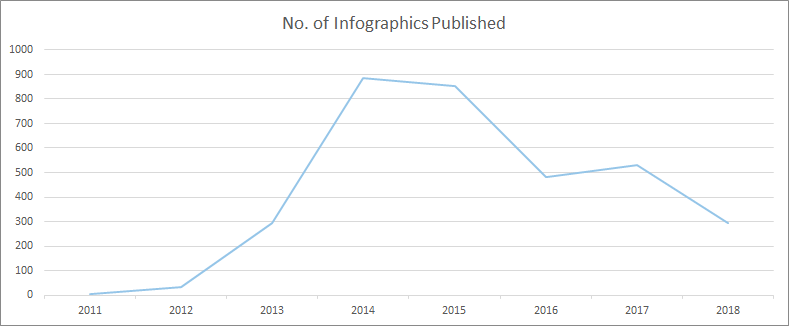
Here’s how many infographics have been featured as part of an article on Entrepreneur.com over the years:

As we’ve not yet finished 2018 (3 months to go at the time this data was pulled), we can estimate the final usage will be in the 380 region, putting it not far from the totals of 2017 and 2016. Impressive stuff in comparison to years gone by.

However, there’s a key unknown here. Is the post-2014/15 drop-off due to lack of outreach? Is it a case of content creators simply deciding infographics were no longer the preferred format to cover topics and build links for clients, as they were a few years ago?

Both my past experiences agency-side and my gut feeling would be that content creators are moving away from it as a core format for link building. Not only would this directly impact the frequency they are published, but it would also impact the investment creators place in producing infographics, and in an environment where infographics need to improve to survive, that would only lead to less features.

Another important data point I wanted to look at was the amount of content being published overall. Without this info, there would be no way of knowing if, with content quality improving all the time, journalists were spending a significantly more time on posts than they had previously while publishing at diminishing rates. To this end, I looked at how much content Entrepreneur.com published each year over the same timeframe:

Although the data shows some differences, the graphs are pretty similar. However, it gets really interesting when we divide the number of infographics by the number of articles in total to find out how many infographics exist per article:

There we have it. The golden years of infographics were certainly 2013 and 2014, but they’ve been riding a wave of consistency since 2015, comprising a higher percentage of overall articles that link builders would have only dreamed of in 2012, when they were way more in fashion.

In fact, by breaking down the number of infographics vs overall content published, there’s a 105% increase in the number of articles that have featured an infographic in 2018 compared to 2012.

Infographics compared to other creative formats

With all this in mind, I still wanted to uncover the fascination with moving away from infographics as a medium of creative storytelling and link building. Is it an obsession with building and using new formats because we’re bored, or is it because other formats provide a better link building ROI?

The next question I wanted to answer was: “How are other content types performing and how do they compare?” Here’s the answer:

Again, using figures publisher-side, we can see that the number of posts that feature infographics is consistently higher than the number of features for interactives and photographic content. Surveys have more recently taken the mantle, but all content types have taken a dip since 2015. However, there’s no clear signal there that we should be moving away from infographics just yet.

In fact, when pitting infographics against all of the other content types (comparing the total number of features), apart from 2013 and 2014 when infographics wiped the floor with everything, there’s no signal to suggest that we need to ditch them:

Year

Infographics vs Interactives

Infographics vs Photography

Infographics vs Surveys

2011

-75%

-67%

-90%

2012

-14%

-14%

-65%

2013

251%

376%

51%

2014

367%

377%

47%

2015

256%

196%

1%

2016

186%

133%

-40%

2017

195%

226%

-31%

2018

180%

160%

-42%

This is pretty surprising stuff in an age where we’re obsessed with interactives and “hero” pieces for link building campaigns.

Surveys are perhaps the surprise package here, having seen the same rise that infographics had through 2012 and 2013, now out-performing all other content types consistently over the last two years.

When I cross-reference to find the number of surveys being used per article, we can see that in every year since 2013 their usage has been increasingly steadily. In 2018, they’re being used more often per article than infographics were, even in their prime:

Surveys are one of the “smaller” creative campaigns I’ve offered in my career. It’s a format I’m gravitating more towards because of their speed and potential for headlines. Critically, they’re also cheaper to produce, both in terms of research and production, allowing me to not only create more of them per campaign, but also target news-jacking topics and build links more quickly compared to other production-heavy pieces.

I think, conclusively, this data shows that for a solid ROI when links are the metric, infographics are still competitive and viable. Surveys will serve you best, but be careful if you’re using the majority of your budget on an interactive or photographic piece. Although the rewards can still be there, it’s a risk.

The link building potential of our link building

For one last dive into the numbers, I wanted to see how different content formats perform for publishers, which could provide powerful insight when deciding which type of content to produce. Although we have no way of knowing when we do our outreach which KPIs different journalists are working towards, if we know the formats that perform best for them (even if they don’t know it), we can help their content perform by proxy — which also serves the performance of our content by funneling increased equity.

Unfortunately, I wasn’t able to extract a comment count or number of social shares per post, which I thought would be an interesting insight to review engagement, so I focused on linking root domains to discover if there is any difference in a publisher’s ability to build links based on the formats they cover, and if that could lead to an increase in link equity coming our way.

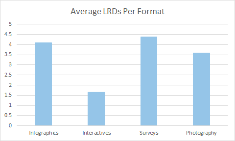
Here’s the average number of links from different domains for each post featuring a different content type received:

Impressively, infographics and surveys continue to hold up really well. Not only are they the content types that the publisher features more often, they are also the content types that build them the most links.

Using these formats to pitch with not only increases the chances that a publisher’s post will rank more competitively in your content’s topic area (and put your brand at the center of the conversation), it’s also important for your link building activity because it highlights the potential link equity flowing to your features and, therefore, how much ends up on your domain.

This gives you the potential to rank (directly and indirectly) for a variety of phrases centered around your topic. It also gives your domain/target page and topically associated pages a better chance of ranking themselves — at least where links play their part in the algorithm.

Ultimately, and to echo what I mentioned in my intro-summary, surveys have become the best format for building links. I’d love to know how many are pitched, but the fact they generate the most links for our linkers is huge, and if you are doing content-based link building with SEO-centric KPIs, they give you the best shot at maximizing equity and therefore ranking potential.

Infographics certainly still seem to have a huge part in the conversation. Only move away from them if there’s proof in your data. Otherwise, you could be missing out for no reason.

That’s me, guys. I really hope this data and process is interesting for everyone, and I’d love to hear if you’ve found or had experiences that lead to different conclusions.


Sign up for The Moz Top 10, a semimonthly mailer updating you on the top ten hottest pieces of SEO news, tips, and rad links uncovered by the Moz team. Think of it as your exclusive digest of stuff you don’t have time to hunt down but want to read!

Continue reading →